Chart Pro ActiveX Controls v24.0

Chart Pro ActiveX Overview
Chart Pro ActiveX is an advanced chart library for Windows development. The Chart ActiveX control brings charts to virtually every development platform for Windows. The Chart Pro controls are easy to understand and can be implemented in only a few lines of code, but they also provide a rich set of classes for customization and enhancement.
Other related ActiveX components:
- Command Bars for ActiveX — Office-style command bars and OneNote-style MDI tab windows with menu and toolbar customization and theme support (OfficeXP, Office 2003, Visual Studio .NET).
- Docking Pane for ActiveX — Visual Studio .NET–style docking panes with tear-off tabs, auto-hide windows and theme support.
- Property Grid for ActiveX — Visual Studio .NET–style property grid with hierarchical properties, toolbar for sorting/grouping and a help panel.
- Grid Control — Hierarchical list display similar to Outlook 2003 inbox.
- Suite Pro Controls — Enhanced components (hyperlink, multi-select tree, browse edit, Office-style color popups, Vista task dialog, etc.).
- Calendar for ActiveX — Office-style calendar control.
- Markup for ActiveX — Additional markup support for controls.
- Shortcut Bar for ActiveX — Office-style themed shortcut bar.
- Task Panel for ActiveX — Task panel similar to Microsoft Office and Windows Explorer.
- Skin Framework for ActiveX — Full application skinning (title bar, scroll bars, buttons, checkboxes, etc.).
- Syntax Edit for ActiveX — Visual Studio .NET–style syntax editor with advanced text editing features.
- Flow Graph ActiveX — Graphing control for relationship diagrams.
Project Overview
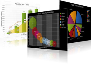
Main Control
- ChartControl — Chart control.
Classes & Objects
The project contains many classes and object models for configuring and rendering charts. Refer to the individual topics for full reference and examples:
- Chart3dFunnelSeriesStyle
- Chart3dPieDiagram
- Chart3dPieSeriesStyle
- Chart3dPyramidSeriesStyle
- Chart3dRotation
- ChartAppearance
- ChartAreaSeriesStyle
- ChartAxis
- ChartAxisAppearance
- ChartAxisConstantLine
- ChartAxisConstantLines
- ChartAxisCustomLabel
- ChartAxisCustomLabels
- ChartAxisGridLines
- ChartAxisLabel
- ChartAxisRange
- ChartAxisStrip
- ChartAxisStrips
- ChartAxisTickMarks
- ChartAxisTitle
- ChartBarSeriesLabel
- ChartBarSeriesStyle
- ChartBorder
- ChartBubbleSeriesStyle
- ChartCandleStickSeriesStyle
- ChartContent
- ChartControlGlobalSettings
- ChartDiagram
- ChartDiagram2D
- ChartDiagram2DAppearance
- ChartDiagram3DAppearance
- ChartDiagramCollection
- ChartElement
- ChartFastLineSeriesStyle
- ChartFillStyle
- ChartFont
- ChartFunnelDiagram
- ChartFunnelSeriesLabel
- ChartFunnelSeriesStyle
- ChartGanttSeriesStyle
- ChartHighLowSeriesStyle
- ChartLegend
- ChartLegendItem
- ChartLineSeriesStyle
- ChartLineStyle
- ChartMarker
- ChartNumberFormat
- ChartPalette
- ChartPieDiagram
- ChartPieSeriesLabel
- ChartPieSeriesStyle
- ChartPointSeriesLabel
- ChartPointSeriesStyle
- ChartPyramidDiagram
- ChartPyramidSeriesLabel
- ChartPyramidSeriesStyle
- ChartRadarAreaSeriesStyle
- ChartRadarDiagram
- ChartRadarLineSeriesStyle
- ChartRadarPointSeriesLabel
- ChartRadarPointSeriesStyle
- ChartRadarSplineAreaSeriesStyle
- ChartRadarSplineSeriesStyle
- ChartRangeBarSeriesLabel
- ChartRangeBarSeriesStyle
- ChartRangeSplineAreaSeriesStyle
- ChartScatterLineSeriesStyle
- ChartSeries
- ChartSeriesCollection
- ChartSeriesErrorBar
- ChartSeriesLabel
- ChartSeriesPoint
- ChartSeriesPointCollection
- ChartSeriesStyle
- ChartSeriesTrendline
- ChartSplineAreaSeriesStyle
- ChartSplineSeriesStyle
- ChartStackedAreaSeriesStyle
- ChartStackedBarSeriesStyle
- ChartStackedSplineAreaSeriesStyle
- ChartStepAreaSeriesStyle
- ChartStepLineSeriesStyle
- ChartTitle
- ChartTitleCollection
- PropExchange
- ToolTipContext — Tool tip window used to display tool tips.
Note: For full class/module descriptions, see the individual topics linked above.
Enumerations
A number of enumerations are provided for configuring chart behavior, formatting and appearance:
- ChartAxisAlignment
- ChartAxisDateTimeScaleUnit
- ArgumentScaleType — used when set to xtpChartScaleDateTime
- ChartBarLabelPosition
- ChartDashStyle
- ChartDateTimeFormatCategory
- ChartDocking
- ChartErrorBarDirection
- ChartErrorBarEndStyle
- ChartErrorBarPosition
- ChartErrorBarType
- ChartFillMode
- ChartFunnelLabelPosition
- ChartGradientAngle
- ChartHatchStyle
- ChartLegendAlignment
- ChartLegendDirection
- ChartLegendSortDirection
- ChartLinearGradientMode
- ChartMarkerType
- ChartNearTextPosition
- ChartNumberFormatCategory
- ChartPanelDirection
- ChartPieLabelPosition
- ChartPyramidLabelPosition
- ChartRadarDiagramStyle
- ChartRangeBarLabelPosition
- ChartRangeBarLabelType
- ChartScaleType
- ChartSeriesTrendlineType
- ChartStringAlignment
- XTPApplicationAmbientProperty
- XTPToolTipIcon
- XTPToolTipStyle
Chart Types
The Chart control supports many chart styles. Each type below includes a short description, an example link and an illustrative image.
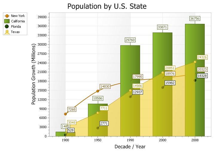
Combination Chart
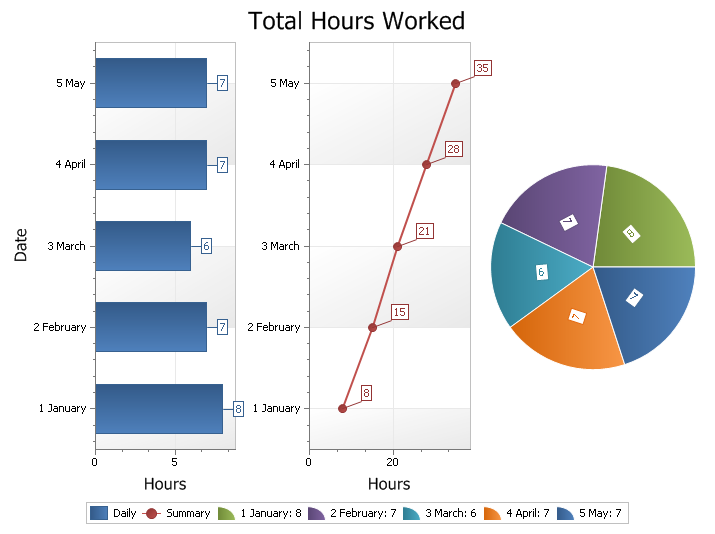
A combination chart uses two or more chart types to emphasize that the chart contains different types of data.
Code example: ChartControl example
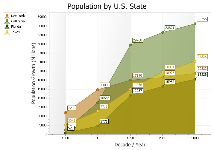
Area Chart
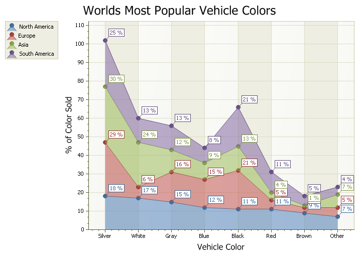
An area chart is similar to a line chart but fills the area beneath the line. Each series is represented with a different color. Commonly used to display accumulated values over time.
Code example: Area chart example
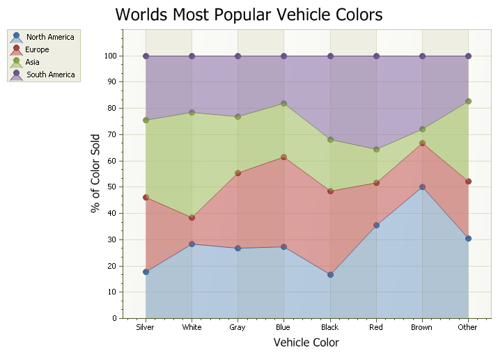
100% Stacked Area Chart
A 100% stacked area chart stacks series so that the values for each category total 100%. Useful for showing relative percentage contributions.
Code example: 100% Stacked Area example
Stacked Area Chart
A stacked area chart stacks series on top of each other to show combined totals. Each series is shown in a different color.
Code example: Stacked area example
Bar Chart
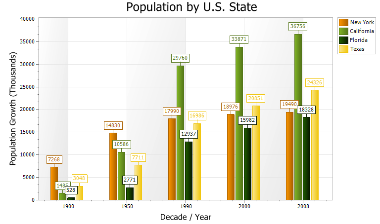
A bar chart displays data with rectangular bars whose lengths are proportional to the represented values. Often used for discrete data categories.
Code example: Bar chart example
Bubble Chart
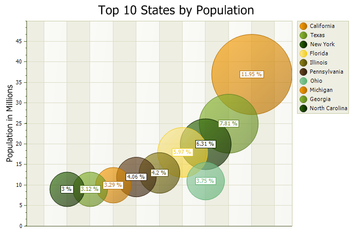
A bubble chart is a variation of a point chart where data points are displayed as bubbles with varying sizes. Useful for representing three dimensions of data.
Code example: Bubble chart example
Candlestick Chart
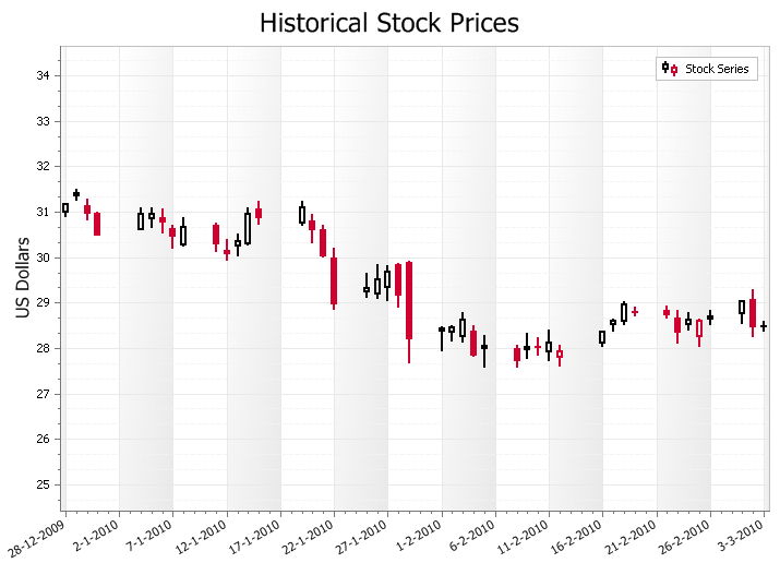
A candlestick chart displays financial data (open, high, low, close) in a trader-friendly format. The candle body shows open/close; wicks show high/low. Helps in identifying market trends.
Code example: Candlestick chart example
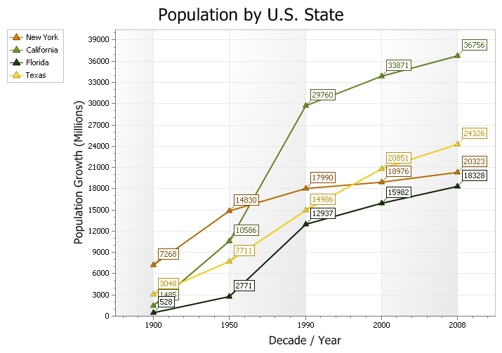
Line Chart
A line chart shows data points connected by straight lines to illustrate trends over time.
Code example: Line chart example
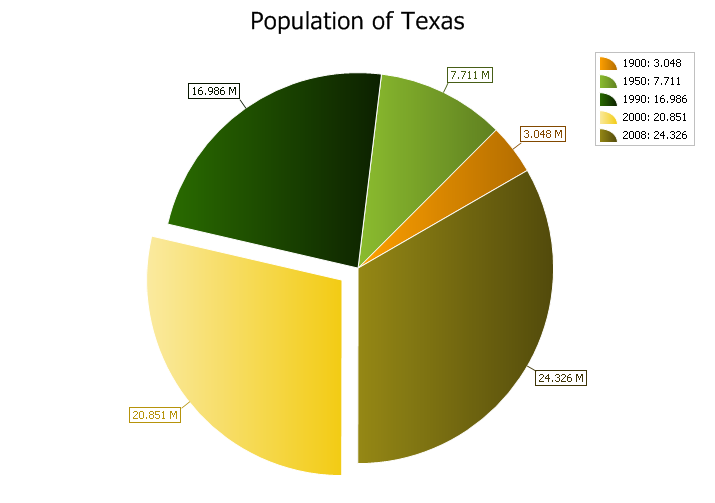
2D Pie Chart
A pie chart displays data as slices of a circle, where each slice is proportional to its value.
Code example: 2D Pie chart example
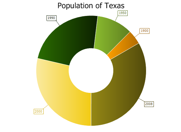
2D Doughnut Chart
A doughnut chart is like a pie chart but with a hole in the center.
Code example: 2D Doughnut chart example
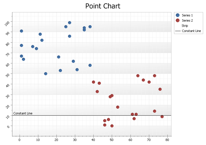
Point (Scatter) Chart
A point chart (scatter plot) displays values using Cartesian coordinates. Useful for scientific data and correlation/relationship visualization.
Code example: Point chart example
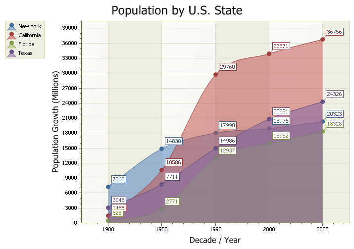
Spline Area Chart
A spline area chart uses smooth spline curves and fills the area under the curve. Suitable for showing accumulated values with a smooth appearance.
Code example: Spline area example
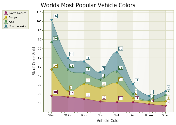
Stacked Spline Area Chart
A stacked spline area chart stacks spline area series. Good for showing smoothed trends across multiple series.
Code example: Stacked spline area example
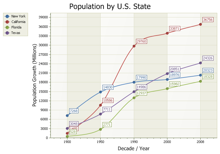
Spline Chart
A spline chart connects data points with smooth curves to illustrate trends.
Code example: Spline chart example
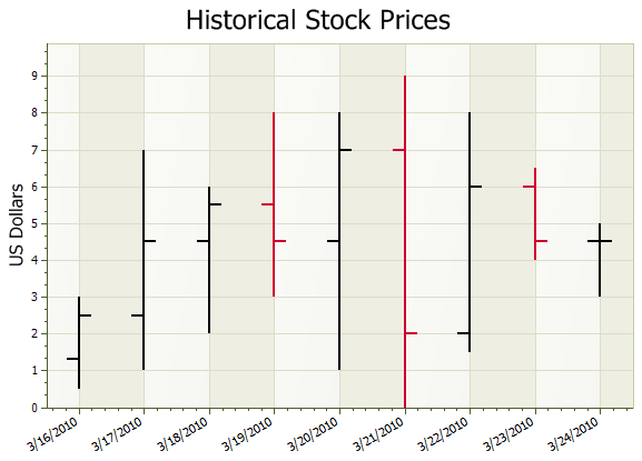
Stock / Bar Chart
A stock/bar chart shows financial high, low, open and close values for each data point. Similar to candlestick charts; presented as bars with tick marks.
Code example: Stock chart example
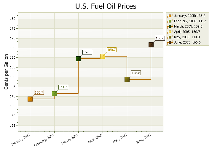
Step Line Chart
A step line chart connects points using horizontal and vertical segments, producing a staircase-like line.
Code example: Step line example
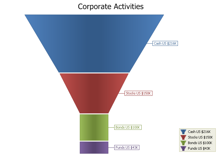
Funnel Chart
A funnel chart shows data as sections of a funnel; each section size is relative to others. Useful for visualizing stages or proportions.
Code example: Funnel chart example
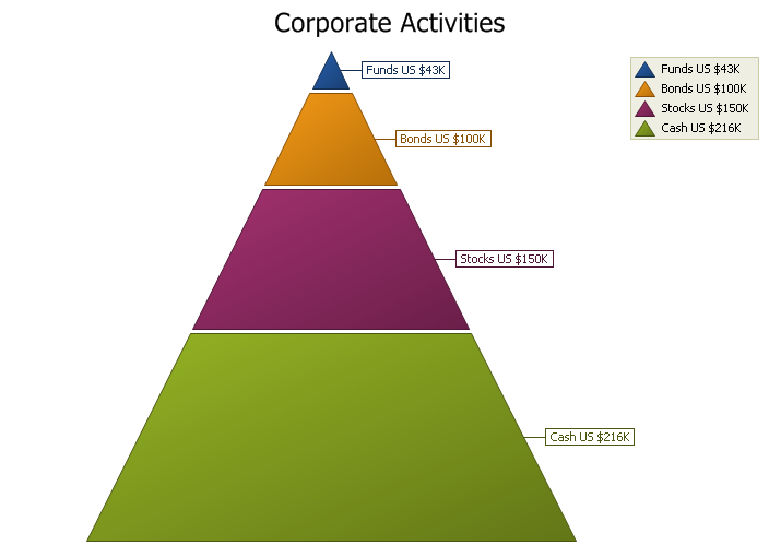
Pyramid Chart
A pyramid chart displays series as sections of a pyramid. Section sizes are relative to each other.
Code example: Pyramid chart example
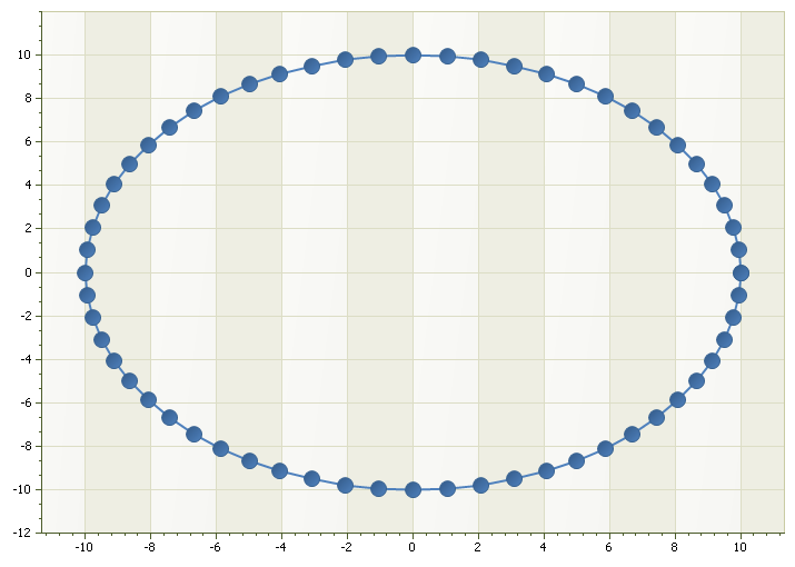
Scatter Line Chart
A scatter line chart plots points in the order entered and connects them with lines. Useful for trend visualization where order matters.
Code example: Scatter line example
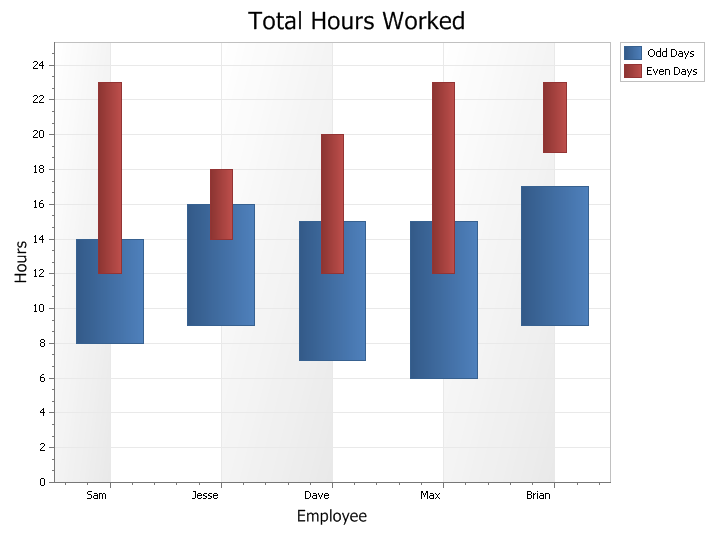
Range Bar Chart
A range bar chart visualizes events or values with a start and end (range). Can be displayed overlapped or side-by-side for comparison.
Code example: Range bar example
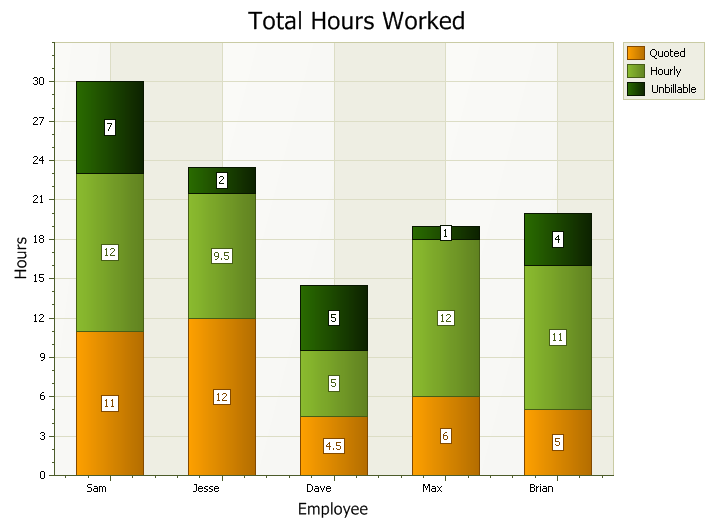
Stacked Bar Chart
A stacked bar chart stacks series values for a given category to show parts-to-whole relationships. Can be vertical or horizontal.
Code example: Stacked bar example
Side-by-Side Stacked Bar Chart
Multiple stacked bars can be displayed side-by-side per category—useful for grouped comparisons (e.g., by country).
Code example: Side-by-side stacked bar example
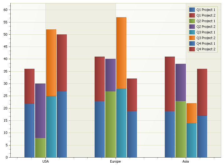
Chart Builder Tool
The supplied Chart Builder tool allows building and customizing charts and exporting them to XML files, which can be loaded by the Chart control.
Code example: Load from file (PropExchange)
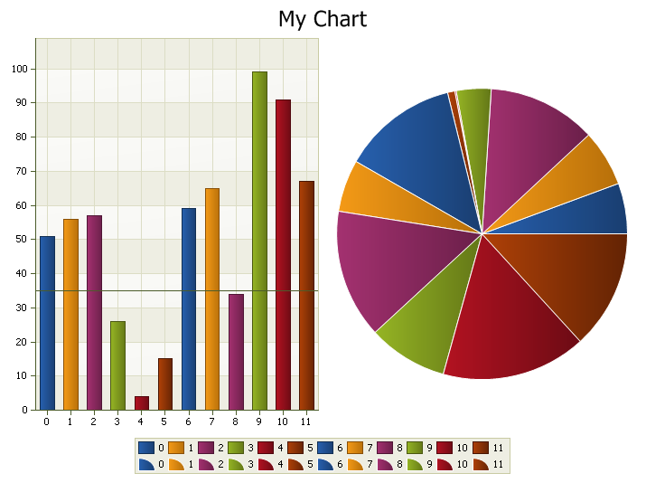
Multiple Chart Diagrams
Different chart types can be combined in the same view (multiple diagrams).
Code example: Multiple diagrams example
Gantt Chart
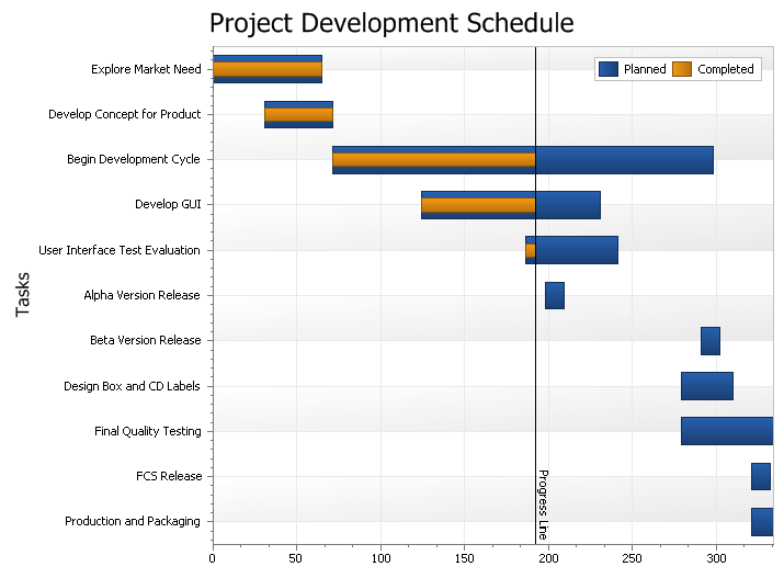
A Gantt chart is a type of range bar chart for task/schedule planning, showing progression and duration of tasks over time.
Code example: Gantt chart example
© 1998–2024 Codejock Software. All rights reserved.
What do you think about this topic? Send feedback!