ChartRadarPointSeriesStyle Object
Description
Radar/Polar Point Style.
For a list of all members defined in this module, see ChartRadarPointSeriesStyle Members.
Object Model





Remarks
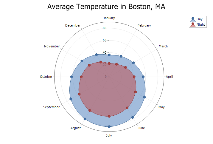
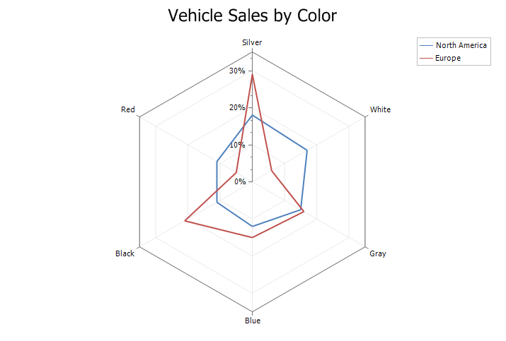
Radar/Polar charts can use several different styles including Area, Spline Area, Line, Line Area, and Point. Furthermore, they can be displayed as a circle diagram or "spider" diagram (straight lines).
Note: To make a "closed" loop, the last data point must be the same as the first.
Radar Chart
Radar charts are essentially another form of a line chart, represented as radar. Data is drawn as a line around the center of the radar. Radar charts use "poles" to display data. Each data point is displayed on one of these poles radiating from the center. For each unique data point in the series, a new pole will be added. The poles are drawn in a 360-degree circle with each pole evenly spaced. The Y-Axis is used to plot data on the poles, while the X-Axis is only used for labeling the poles. Data is plotted as (label, y), where "label" is the label for the pole and "y" is the distance from the center of the circle.
Radar charts are typically used to compare data for a set of categories. They make it easy to compare relative values for a single data point and identify similar or dissimilar points. Radar charts are best suited for showing commonality and outliers (e.g., certain car models tend to be more expensive with poor gas mileage). Typical uses for a radar chart include:
- Categories of data that occur in cycles (like nature, months of the year)
- Comparing differences between actual/measured and ideal/estimated data (e.g., estimated vs actual sales, sales by department, team performance, quality control)
- Comparing strengths and weaknesses (e.g., sports, department analysis)
Polar Chart
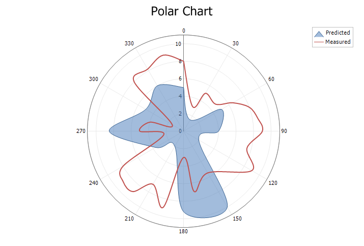
Polar charts use polar coordinates to plot data. The X-Axis is a circle, and the values are typically fixed in degrees (0-360) or radians. However, the chart allows you to set any desired range. Data is plotted in terms of values and angles, where "x" is the angle/rotation and "y" is the distance from the center of the circle.
Polar charts are best suited for plotting polar data. Plotting mathematical functions is a common use for a polar chart. Any type of data represented by an angle and distance would be ideal. For some data, it is useful to use the poles as a compass (North, South, East, West, etc.) and plot data relative to these directions (e.g., the location of houses can be plotted relative to the specified origin).
Area Style
Line Style
Spline and Spline Area Styles
Point Style
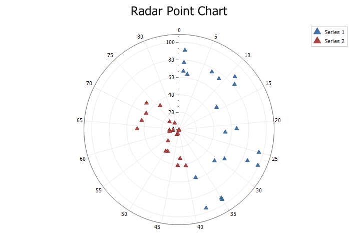
Example
'Radar/Polar Point Style

ChartControl.Content.Legend.Visible = True
ChartControl.Content.Legend.HorizontalAlignment = xtpChartLegendFar
ChartControl.Content.EnableMarkup = True

ChartControl.Content.Titles.Add "Radar Point Chart"

Dim Style As ChartRadarPointSeriesStyle

Dim Series As ChartSeries
Set Series = ChartControl.Content.Series.Add("Series 1")

Series.ArgumentScaleType = xtpChartScaleNumerical

Series.Points.Add 1, 67
Series.Points.Add 14, 50
Series.Points.Add 9, 74
Series.Points.Add 38, 58
Series.Points.Add 2, 64
Series.Points.Add 25, 95
Series.Points.Add 1, 77
Series.Points.Add 1, 91
Series.Points.Add 35, 92
Series.Points.Add 27, 86
Series.Points.Add 31, 54
Series.Points.Add 22, 53
Series.Points.Add 12, 82
Series.Points.Add 21, 66
Series.Points.Add 38, 95
Series.Points.Add 7, 76
Series.Points.Add 11, 88
Series.Points.Add 29, 62
Series.Points.Add 27, 99
Series.Points.Add 35, 94

Set Style = New ChartRadarPointSeriesStyle
Set Series.Style = Style

Set Series = ChartControl.Content.Series.Add("Series 2")
Series.Points.Add 63, 11
Series.Points.Add 42, 33
Series.Points.Add 73, 14
Series.Points.Add 61, 11
Series.Points.Add 53, 18
Series.Points.Add 67, 44
Series.Points.Add 62, 7
Series.Points.Add 77, 9
Series.Points.Add 43, 41
Series.Points.Add 49, 28
Series.Points.Add 76, 35
Series.Points.Add 70, 42
Series.Points.Add 48, 6
Series.Points.Add 40, 42
Series.Points.Add 64, 48
Series.Points.Add 46, 5
Series.Points.Add 50, 29
Series.Points.Add 50, 0
Series.Points.Add 46, 1
Series.Points.Add 73, 48

Set Style = New ChartRadarPointSeriesStyle
Set Series.Style = Style

Dim Diagram As ChartRadarDiagram
Set Diagram = ChartControl.Content.Diagrams(0)
Diagram.AxisX.TickMarks.Visible = False
See Also
ChartRadarPointSeriesStyle Members
Copyright (c) 1998-2024 Codejock Technologies. All rights reserved.