Class: cWebCardContainer
Properties | Events | Methods | Index of Classes
The Web Framework card container. Used with embedded card pages to provide a stack of overlaid panels
Hierarchy
cObject > cWebBaseObject > cWebObject > cWebBaseUIObject > cWebBaseDEOServer > cWebBaseControl > cWebCardContainer
Show full hierarchy and direct subclasses
Library: Web Application Class Library
Package: cWebCardContainer.pkg
Description
Multiple cWebCard objects are nested inside a parent cWebCardContainer. This provides a vertical stack of card objects where each card can contain additional web controls. Only one card is displayed at a time and an interface exists for navigating through the stack of cards.
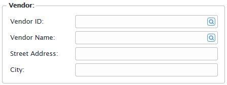
Note that cWebgroup is a non-visual container by default. The image above is what it looks like when the pbShowBorder property in the parent object is set to True.
Card containers are ideal for building wizard dialogs, for overlaying groups of controls in your View (cWebView), or any use you can imagine where control paging is required.
See cWebGroup if you simply need a dedicated group control without the additional special abilities of web cards.
Sample
Object oCardContainer is a cWebCardContainer
    Set pbShowCaption to True
    Set pbShowBorder to True

    Object oCard1 is a cWebCard
        Set piColumnCount to 4
        Set psCaption to "Card One"

        Object oWebButton is a cWebButton
            Set piColumnSpan to 1
            Set psCaption to "Next >>"

            Procedure OnClick
                Send NextCard
            End_Procedure
        End_Object
    End_Object

    Object oCard2 is a cWebCard
        Set piColumnCount to 4
        Set psCaption to "Card Two"

        Object oWebButton is a cWebButton
            Set piColumnSpan to 1
            Set psCaption to "Next >>"

            Procedure OnClick
                Send NextCard
            End_Procedure
        End_Object
    End_Object

    Object oCard3 is a cWebCard
        Set piColumnCount to 4
        Set psCaption to "Card Three"

        Object oWebButton is a cWebButton
            Set piColumnSpan to 1
            Set psCaption to "First >>"

            Procedure OnClick
                Send Show to oCard1
            End_Procedure
        End_Object
    End_Object
End_Object
Object Name
The Web Framework uniquely identifies each object via a combination of the object hierarchy (object nesting), and object name. This means that object names must be unique within their parent.
Object Placement
For object placement, card containers are analogous to a web control. Card containers must be placed within a web container (e.g. cWebPanel, cWebView or cWebModalDialog).
Card containers may not be nested inside web controls. You may not mix card containers and web panels as sibling objects.
Changing the Top Card
The card order in a stack is determined by the object order of child card (cWebCard) objects. Send NextCard and PreviousCard to change the current top card to the next or previous card.
Sending NextCard when the last card is current or PreviousCard when the first card is current has no effect, i.e. NextCard & PreviousCard do not wrap.
Send Show to a card object to make it the current top card. Get CurrentCard to retrieve the object handle of the current top card.
Card change events can be handled on the server by writing DataFlex code. Card change can also be handled on the client (browser) by writing JavaScript code. Writing a server-side DataFlex handler is the simplest way to handle card change events.
Set pbServerOnCardChange to true to trigger the OnCardChange event on the server. By default this property is false. Write an OnCardChange event handler in your card container object to perform some action when the current top card changes.
To write a client-side card change handler using JavaScript set the psClientOnCardChange property to the name of the JavaScript function that will execute when the current top card changes.
Size and Location
Card containers are positioned by HTML flow layout (left to right, top to bottom). The relative position of the card container in this flow is determined by the location of the object declaration in your code.
In addition to the flow layout, the parent container is divided into a fixed number of equal-width columns (piColumnCount). Card containers are aligned to these columns to determine their horizontal position and width.
Set piColumnIndex to position a card container in a particular column of the parent container. By default the card container is positioned in column 0.
Set piColumnSpan to determine the width of the card container i.e., the number of columns occupied by the card stack. The actual width is determined by the number of columns and the width of the parent container. By default the card container occupies all available columns of the parent.
For more information, see Positioning and Layout of Controls.
By default, the height will increase in order to accommodate the size of the tallest card in the card container's stack.
Set piHeight of the parent card container to fix the overall height for all card objects in the stack. If a particular card requires a height larger than this value, it will display a vertical scrollbar.
Border and Caption
Card objects can have an optional border and each card object can display a caption. The caption is usually displayed in the card's top left corner. Set pbShowCaption to true to enable captions for each child card. Set psCaption in each card to specify the caption displayed on each card.
Set pbShowBorder to true to draw a border around the entire card stack.
Drag and Drop Support
This control can be used as a valid drop target by registering it as such in a cWebDragDropHelper object.
The supported actions for this control are: - C_WebDropOnControl
This allows the control to accept data dragged from elsewhere in the control (if configured that way) and can also be used to accept files when registered within a cWebDragDropFileHelper.
Color
The background color of a card stack is determined by the web application's CSS theme (psTheme). You can define additional or replacement CSS styles in your web application's application.css file. Set psCSSClass to the CSS class name you would like to be applied to a card object.