Class: cWebAccordionContainer
Properties | Events | Methods | Index of Classes
Web Container that is divided into sections (cards) showing a horizontal header
Hierarchy
cObject > cWebBaseObject > cWebObject > cWebBaseUIObject > cWebBaseDEOServer > cWebBaseControl > cWebCardContainer > cWebAccordionContainer
Show full hierarchy and direct subclasses
- cObject
- cWebBaseObject
- cWebObject
- cWebBaseUIObject
- cWebBaseDEOServer
- cWebBaseControl
- cWebCardContainer
- cWebAccordionContainer
Library: Web Application Class Library
Package: cWebAccordionContainer.pkg
Description
Container that is divided into sections (cards) showing a horizontal header.
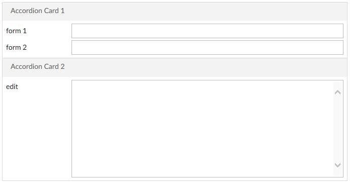
The sections can be expanded and collapsed independently or one at a time. An animation is shown when sections open or close. This can be seen as an alternative to the cWebTabContainer.
Nested within the accordion container object should be cWebAccordionCard objects that each represent a section. Inside the cards one can place controls.
Object oWebAccordionContainer1 is a cWebAccordionContainer
    Set pbMultiOpen to True
    Set pbAutoHeight to False

    Object oWebAccordionCard1 is a cWebAccordionCard
        Set piColumnCount to 12
        Set psCaption to "Accordion Card 1"

        Object oWebForm1 is a cWebForm
            Set piColumnSpan to 0
            Set psLabel to "form 1"
        End_Object

        Object oWebForm2 is a cWebForm
            Set piColumnSpan to 0
            Set psLabel to "form 2"
        End_Object
    End_Object

    Object oWebAccordionCard2 is a cWebAccordionCard
        Set piColumnCount to 12
        Set psCaption to "Accordion Card 2"

        Object oWebEdit1 is a cWebEdit
            Set piColumnSpan to 0
            Set psLabel to "edit"
            Set piHeight to 200
        End_Object
    End_Object
End_Object
Drag and Drop Support
This control can be used as a valid drop target by registering it as such in a cWebDragDropHelper object.
The supported actions for this control are: - C_WebDropOnControl
This allows the control to accept data dragged from elsewhere in the control (if configured that way) and can also be used to accept files when registered within a cWebDragDropFileHelper.