Docking Pane ActiveX Controls v24.0

Docking Pane ActiveX Overview

Command Bars for ActiveX provides Windows developers with a sophisticated Office-style Command Bars and One Note style MDI tab windows. The framework fully supports menu and toolbar customization to give you more control over your application's workspace. Command Bars come with built-in theme support that allows you to choose from predefined themes such as Office XP, Office 2003, and Visual Studio .NET.
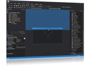
Docking Pane for ActiveX provides Windows developers with a sophisticated Visual Studio.NET™ style docking pane. Developers can easily create tear-off tabs and auto-hide windows that allow for a more manageable application workspace. The docking panes come with built-in theme support that allows you to choose from predefined themes such as Visio and Visual Studio .NET.
Property Grid for ActiveX provides Windows developers with a sophisticated Visual Studio.NET™ style property grid. Developers can easily create a hierarchical list of editable properties and represent many different data types or sub-items. The property grid comes with a built-in toolbar for easy sorting and grouping, and a help panel to display information on each selected item.
Codejock Software's Grid Control allows you to display a hierarchical list of items similar to Outlook 2003 email inbox.
Suite Pro Controls provide many enhanced components such as hyperlink and multiple selection tree controls, browse edit and Office style color popups, Vista task dialog, and much more.
Calendar for ActiveX provides Windows developers with a sophisticated Office-style Calendar.
Markup for ActiveX provides additional Markup Support for Controls.
Shortcut Bar for ActiveX provides developers with full theme support, giving their applications the closest, most exact Office-style themes of any third-party tool available today.
Task Panel for ActiveX provides Windows developers with features similar to the Task Panels seen in Microsoft Office and Windows Explorer. You can easily manage your application shortcuts and have a unique way of displaying information to the end user.
Skin Framework for ActiveX allows Windows developers to fully skin their applications, including components such as title bar, scroll bars, buttons, checkboxes, and option buttons.
Syntax Edit for ActiveX is a Visual Studio .NET style Syntax Editor Control that provides users with a highly sophisticated text editor control that supports advanced features such as text block grouping, syntax colorization, line numbers, font type, pre-defined color schemes, bookmarks, breakpoints, and many more advanced features.
Flow Graph ActiveX is a graphing control used to display relationship graphs. This can be thought of as a relationship diagram commonly used to display the relationships for a relational database.
Chart Pro ActiveX is an advanced chart library for Windows environment software development. The Chart ActiveX control brings the chart to virtually every development platform for Windows. The Chart Pro controls are easy to understand and can be implemented in only a few lines of code, but it also provides a rich set of classes for customization and enhancement.
Project Overview
Controls
| Control | Description |
|---|---|
| DockingPane | Represents a DockingPane manager. |
| DockingPaneFrame | DockingPane object that contains its own frame. Designed for use in environments such as Access. |
Additional Classes
| Class Module | Description |
|---|---|
| ColorManager | The ColorManager allows you to get the system colors for each display element of your application. Display elements are the parts of a window and the display that appear on the system display screen. Display elements are easily referenced by index. |
| DockingPaneGlobalSettings | Docking Pane Global Settings. |
| DockingPaneLayout | The DockingPaneLayout object is used to store a docking pane layout. The DockingPaneLayout object holds the same layout information that the SaveState and SaveStateToString methods save. |
| DockingPaneOptions | The options for the DockingPanes. |
| DockingPanePaintManager | The DockingPanePaintManager object is used to hold various pane painting properties. |
| DockingPaneTrackSize | Object used to store the minimum and maximum pane widths and heights. |
| ImageManagerIcon | Represents a single image in a component. |
| ImageManagerIcons | A collection of icons. |
| ImageManagerIconSet | Represents a collection of icons in the ImageManager for enumeration purposes. |
| Pane | Represents a docking pane. |
| PaneActionContainer | Container object used in creating the structure/layout of docking panes. |
| PropExchange | Object used for reading and writing CommandBar, Docking Pane, Task Panel, and Grid Control layout information to/from an XML file, the registry, or binary file. |
| ResourceImages | Object used to load and access resource themes for the control, i.e., Office 2007, Office 2007/2010 Ribbon, Office 2010, and Windows 7 appearances. |
| TabControlItem | A tab object. |
| TabManagerMargin | Manages the left, top, bottom, and right margins of the rectangle of the button, client, control, and header. |
| TabPaintManager | Represents the appearance of the tabs. |
| TabPaintManagerColorSet | TabPaintManagerColorSet stores the colors used to paint the elements that make up a tab. The default tab colors for each theme can be changed using the ColorSet property. |
| ToolTipContext | ToolTipContext object represents the tool tip window that is used to display tool tips. |
Enumerations
| Enumeration | Description |
|---|---|
| DockingContextStickerStyle | Specifies the style of the docking stickers. |
| DockingDirection | Specifies the direction where a pane is docked. |
| DockingPaneAction | Specifies the action a docking pane is currently performing. |
| DockingPaneCaptionButtonStyle | Caption button styles. |
| DockingPaneCaptionDirection | Specifies the direction that the docking pane caption will be displayed. This will be vertical or horizontal. |
| DockingPaneEnableOptions | Flags that specify the extent a pane is enabled/disabled. |
| DockingPaneKeyboardNavigate | Specifies the keyboard keys that can be used to navigate the docking panes. |
| DockingPaneSplitterStyle | Specifies the docking pane splitter bar style. |
| DockingPaneTabButtonFlags | Options to specify when a tab close button will be shown. |
| DockingPaneType | Specifies the type of a docking pane container. |
| PaneOptions | Docking Pane Options enumeration. |
| VisualTheme | Specifies various visual themes which are used to display docking panes. |
| XTPApplicationAmbientProperty | Display element colors. |
| XTPColorManagerColor | Enumeration used to determine the current Windows XP theme in use. |
| XTPCurrentSystemTheme | Specifies the state of an icon. |
| XTPImageState | Converts the measurement units between pixels and twirps. |
| XTPTabAppearanceStyle | The appearance of the tabs. |
| XTPTabClientFrame | The type of border that will be used around the client frame. |
| XTPTabColorStyle | Sets the color style of the tabs for the currently set Appearance. |
| XTPTabDrawTextFormat | Specifies the text format used for displaying text in tab buttons. |
| XTPTabLayoutStyle | Specifies how the tabs will be sized within the tabbed workspace. |
| XTPTabPosition | The position of the tabs within the tabbed workspace. |
| XTPTabToolTipBehaviour | Specifies when tool tips should be displayed for tab buttons in groups of panes. |
| XTPToolTipIcon | Specifies the icon that will be displayed in the tool tip window when displaying the title and description of the control using the ShowTitleAndDescription method. |
| XTPToolTipStyle | Specifies the style of the tool tip when it is displayed. |
Copyright (c) 1998-2024 Codejock Software. All rights reserved.
What do you think about this topic? Send feedback!