CommandBarGalleryItem Object
See Also
- CommandBarGalleryItem Members
- CommandBarGallery Object
- Gallery Items Collection
- AddItem Method
- AddLabel Method
- DrawItem Event
- ItemHeight Property
- ItemWidth Property
- CreateGalleryItems Method

Description
A label, string, or image item that is displayed in a CommandBarGallery.
For a list of all members defined in this module, see CommandBarGalleryItem members.
Remarks
CommandBarGalleryItem objects can be a label item, text item, or image item and are displayed in a CommandBarGallery.
The CreateGalleryItems method must be used to create a CommandBarGalleryItems collection before adding CommandBarGalleryItem objects to a gallery. Note that the Id of the CommandBarGalleryItems collection must use the same Id as the gallery control.
The Items collection allows you to access, add, modify, and delete the items in a gallery. The AddItem and AddLabel methods are used to add CommandBarGalleryItem objects to the Item collection, while the DeleteAll and DeleteAt methods are used to delete items from the Item collection.
The illustration below shows a gallery control that contains both label and normal gallery items.
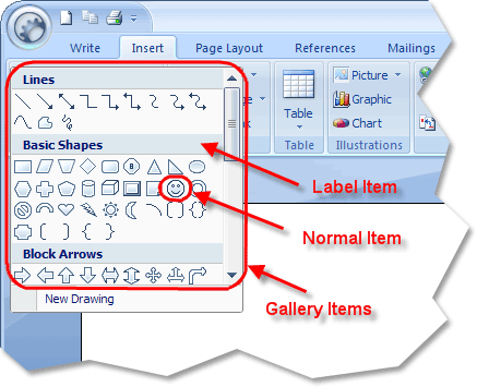
The Icons property allows you to use a separate ImageManagerIcons collection for each collection of gallery items, or you can use the same collection for all. These are the images used for CommandBarGalleryItem objects that display an image. The Id of the CommandBarGalleryItem object is used to uniquely identify the control. Label items will have an Id of 0 by default; you can change this if you like, but the AddLabel method does not allow you to set it at the time of creation. Label items cannot display icons, so the ImageIndex property will not be used for a Label item.
The ItemHeight and ItemWidth properties specify the width and height of all the CommandBarGalleryItem objects in a Gallery Items Collection. Setting ItemWidth to 0 (zero) tells the gallery to auto size the width of items to best fit.
Scroll bars are used to scroll through the items in a gallery if they are not all currently visible. By default, a scroll bar will be displayed for all galleries, regardless of whether it needs one. The ShowScrollBar property can be used to remove the scroll bar for galleries that do not need them. The Width and Height properties are used to specify the width and height of the gallery. They can be used to ensure that all items will be visible, so no scroll bars would be needed. When a gallery is displayed in a standard toolbar, usually only the width is set; when displayed in a popup toolbar, both width and height are commonly set.
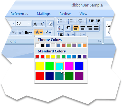
The DrawItem event is called before each CommandBarGalleryItem in a CommandBarGallery is drawn. The DrawItem event is used to override the standard drawing functionality of the CommandBarGalleryItem(s) in a CommandBarGallery. This can be very useful to draw custom gallery items.
The illustration below shows a gallery control that is used as a color selector. The color squares in the gallery are all custom drawn in the DrawItem event.
The ClipItems property specifies whether drawing optimization is used when drawing the CommandBarGalleryItem objects in a gallery. Drawing optimization means that only the item that is checked, the selected item, and the previously selected item are re-drawn.
See Also
- CommandBarGalleryItem Members
- CommandBarGallery Object
- Gallery Items Collection
- AddItem Method
- AddLabel Method
- DrawItem Event
- ItemHeight Property
- ItemWidth Property
- CreateGalleryItems Method
Example
Copyright (c) 1998-2024 Codejock Technologies. All rights reserved.