XTPToolTipStyle Enumeration
Description
Specifies the style of the tool tip when it is displayed.
Members
| Member | Description |
|---|---|
| xtpToolTipStandard | Standard window style. The tool tips window will be in the shape of a rectangle with a solid dark border around it. |
| xtpToolTipBalloon | Balloon window style. The tool tip window will be in the shape of a balloon. |
| xtpToolTipOffice | Office window style. The tool tips window will be in the shape of a rectangle with a dark border on the right and bottom sides and a light border on the top and left sides. |
| xtpToolTipRTF | Rich-Text Format (RTF) window style. The tool tips window will be in the shape of a rectangle with a solid dark border around it. If the text stored in the ToolTipText property is in RTF format, the tool tip will be displayed using the RTF formatting. This includes font, font size, color, bullets, etc. |
| xtpToolTipLuna | Tool tips will use the Windows XP Luna color gradient as the back color of the tooltip window. The color depends on the appearance style of the operating system. |
| xtpToolTipOffice2013 | Tooltip will use the Office 2013 window style. |
| xtpToolTipOffice2016 | Tooltip will use the Office 2016 window style. |
| xtpToolTipHTML | Tooltip will use HTML formatting to format the tooltip. |
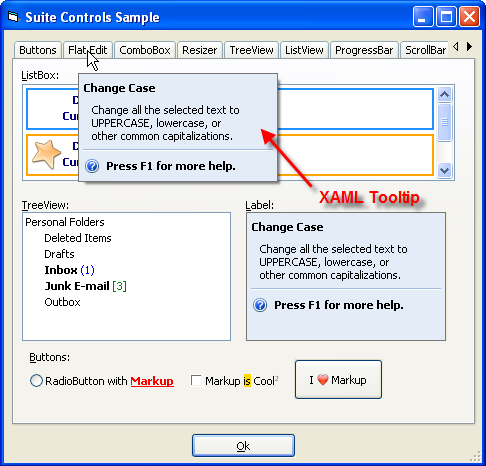
| xtpToolTipMarkup | Tooltip will use XAML MarkUp formatting to format the tooltip. See this sample. |
Remarks
By default, the text that is stored in the ToolTip property will be displayed in the tool tip window. If this property is not set, then the title/caption of the item will be used.
Requirements
The xtpToolTipBalloon XTPToolTipStyle requires Internet Explorer 5.0 or above to be installed. The IsBalloonStyleSupported method can be used to determine if the xtpToolTipBalloon style is supported.
XAML Tooltips
Only controls with a TooltipContext property can use Markup for tooltips. The sample below shows a TabControl that uses Markup tooltip; in this case, the second tab's tooltip is being set. Note that EnableMarkup is not needed to enable Markup for the tooltip. The style of the tooltip must be set to xtpToolTipMarkup. To display both a Markup Tooltip and Markup in the caption on the TabControl tabs, both EnableMarkup and xtpToolTipMarkup are required. The xtpToolTipMarkup style is required to display Markup tooltips for the TabControl (or any other TooltipContext enabled control). Note that the sample uses images stored in an ImageManager as the image source.
The sample below will use XAML to create a tooltip for a tab button in a TabControl.
Example
XAML Tooltip (Visual Basic)
This sample shows how to use XAML MarkUp for a ToolTip.
' VB 6 code snippet
TabControl.ToolTipContext.Style = xtpToolTipMarkup

TabControl.Item(1).ToolTip = _
    "<BorderBrush='#767676' Background='#e4ecf7'>" & _
    "<TextBlock VerticalAlignment='Center' FontWeight='Bold'>Press F1 for more help.</TextBlock>" & _
    "<TextBlock>Change all the selected text to UPPERCASE, lowercase, or other common capitalizations.</TextBlock>"
See Also
Copyright (c) 1998-2024 Codejock Technologies. All rights reserved.