Markup ActiveX Controls v24.0

Markup ActiveX Overview

Command Bars for ActiveX provides Windows developers with a sophisticated Office-style Command Bars and One Note style MDI tab windows. The framework fully supports menu and toolbar customization to give you more control over your application's workspace. Command Bars come with built-in theme support that allows you to choose from predefined themes such as Office XP, Office 2003, and Visual Studio .NET.
Docking Pane for ActiveX provides Windows developers with a sophisticated Visual Studio.NET™ style docking pane. Developers can easily create tear-off tabs and auto-hide windows that allow for a more manageable application workspace. The docking panes come with built-in theme support that allows you to choose from predefined themes such as Visio and Visual Studio .NET.
Property Grid for ActiveX provides Windows developers with a sophisticated Visual Studio.NET™ style property grid. Developers can easily create a hierarchical list of editable properties and represent many different data types or sub-items. The property grid comes with a built-in toolbar for easy sorting and grouping, and a help panel to display information on each selected item.
Codejock Software's Grid Control allows you to display a hierarchical list of items similar to Outlook 2003 email inbox.
Suite Pro Controls provide many enhanced components such as hyperlink and multiple selection tree controls, browse edit and Office style color popups, Vista task dialog, and much more.
Calendar for ActiveX provides Windows developers with a sophisticated Office-style Calendar.
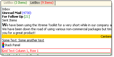
Markup for ActiveX provides additional Markup Support for Controls.
Shortcut Bar for ActiveX provides developers with full theme support, giving their applications the closest, most exact Office-style themes of any third-party tool available today.
Task Panel for ActiveX provides Windows developers with features similar to the Task Panels seen in Microsoft Office and Windows Explorer. You can easily manage your application shortcuts and have a unique way of displaying information to the end user.
Skin Framework for ActiveX allows Windows developers to fully skin their applications, including components such as title bar, scroll bars, buttons, checkboxes, and option buttons.
Syntax Edit for ActiveX provides a Visual Studio .NET style Syntax Editor Control that offers users a highly sophisticated text editor control supporting advanced features such as text block grouping, syntax colorization, line numbers, font type, predefined color schemes, bookmarks, breakpoints, and many more advanced features.
Flow Graph ActiveX is a graphing control used to display relationship graphs, commonly used to display the relationships for a relational database.
Chart Pro ActiveX is an advanced chart library for Windows environment software development. The Chart ActiveX control brings the chart to virtually every development platform for Windows. The Chart Pro controls are easy to understand and can be implemented in only a few lines of code, but they also provide a rich set of classes for customization and enhancement.
Project Overview

MarkupLabel
MarkupLabel control is used to display XAML Markup.
| Control | Description |
|---|---|
| A |
Classes
- ImageManagerIconSet
- IMarkupGlobalSettings
- IResourceImageList
- MarkupBold
- MarkupBorder
- MarkupBrush
- MarkupSolidBrush
- MarkupButton
- MarkupButtonBase.ClickEvent
- MarkupButtonBase
- MarkupCanvas
- MarkupCheckBox
- MarkupColumnDefinition
- MarkupContentControl
- MarkupContext
- MarkupControl
- MarkupDefinitionBase
- MarkupDefinitionCollection
- MarkupDockPanel
- MarkupDoubleCollection
- MarkupEllipse
- MarkupFrameworkElement
- MarkupGlobalSettings
- MarkupGrid
- MarkupHyperlink
- MarkupImage
- MarkupInline
- MarkupInlineCollection
- MarkupInlineUIContainer
- MarkupInputElement
- MarkupItalic
- MarkupLabelPropPage
- MarkupLine
- MarkupObject
- MarkupPage
- MarkupPanel
- MarkupPath
- MarkupPolygon
- MarkupPolyline
- MarkupRadioButton
- MarkupRectangle
- MarkupRoutedEvent
- MarkupRoutedEventArgs
- MarkupRowDefinition
- MarkupRun
- MarkupScrollViewer
- MarkupShape
- MarkupSolidColorBrush
- MarkupSpan
- MarkupStackPanel
- MarkupTextBlock
- MarkupTextElement
- MarkupThickness
- MarkupToggleButton
- MarkupUIElement
- MarkupUIElementCollection
- MarkupUnderline
- MarkupUniformGrid
- MarkupViewbox
- MarkupVisual
- MarkupWindowContainer
- MarkupWrapPanel
- ToolTipContext
Class Module Descriptions
| Class Module | Description |
|---|---|
| Represents a collection of icons in the ImageManager for enumeration purposes. | |
| Markup Global Settings | |
| An inline-level flow content element which causes content to render with a bold font weight. | |
| Draws a border, background, or both around another element. | |
| Base class for the | |
| Represents a button (Toggle, Radio, CheckBox, etc.) control, which reacts to the | |
| Represents the base class for all Button (Toggle, Radio, CheckBox) controls. | |
| Defines an area within which you can explicitly position child elements by using coordinates that are relative to the MarkupCanvas area. | |
| Represents a control that a user can select and clear. | |
| Defines column-specific properties that apply to MarkupGrid elements. | |
| Represents a control with a single piece of content. | |
| Object used to connect XML Markup with methods, functions, and events. This allows XML Markup to call any method, function, or event from code (VB, C#, etc.). It contains methods to create Markup Objects in code. | |
| Represents the base class for user interface (UI) elements such as buttons. | |
| Defines the functionality required to support a shared-size group that is used by the MarkupColumnDefinitionCollection and MarkupRowDefinitionCollection classes. | |
| Provides access to a collection of MarkupColumnDefinition or MarkupRowDefinition objects. | |
| Defines an area where you can arrange child elements either horizontally or vertically, relative to each other. | |
| Draws an ellipse. | |
| Base class for all the "controls" for example, StackPanel, Grid, etc. | |
| Markup Global Settings | |
| Grid Control | |
| An inline-level flow content element that provides facilities for hosting hyperlinks within flow content. | |
| Represents a control that displays an image. | |
| An abstract class that provides a base for all inline flow content elements. | |
| Represents a collection of MarkupInline elements. MarkupInlineCollection defines the allowable child content of the MarkupSpan and MarkupTextBlock elements. | |
| An inline-level flow content element which enables MarkupUIElement elements to be embedded in flow content. | |
| Establishes the common events and also the event-related properties and methods for basic input processing by Markup elements. | |
| Provides an inline-level flow content element that causes content to render with an italic font style. | |
| Property page for MarkupLabel Control | |
| Draws a straight line between two points. | |
| Base class for all Markup Objects. | |
| Encapsulates a page of content that can be navigated to and hosted by an Internet browser. | |
| Provides a base class for all | |
| Draws a series of connected lines and curves. | |
| Draws a polygon, which is a connected series of lines that form a closed shape. | |
| Draws a series of connected straight lines. | |
| Radio button control. | |
| Draws a rectangle. | |
| Represents and identifies a routed event and declares its characteristics. | |
| Contains state information and event data associated with a routed event. | |
| Defines row-specific properties that apply to MarkupGrid elements. | |
| An inline-level flow content element intended to contain a run of formatted or unformatted text. | |
| The MarkupScrollViewer control creates a scrollable region wherein content can be scrolled horizontally or vertically. | |
| Provides a base class for shape elements, such as | |
| Paints an area with a solid color. | |
| Groups other | |
| Arranges child elements into a single line that can be oriented horizontally or vertically. | |
| Provides a lightweight control for displaying small amounts of flow content. | |
| An abstract class used as the base class for the abstract | |
| Base class for controls that can switch states, such as a CheckBox and RadioButton. | |
| Base class for Markup core level implementations building on Markup elements and basic presentation characteristics. | |
| Represents an ordered collection of MarkupUIElements. | |
| An inline-level flow content element which causes content to render with an underlined text decoration. | |
| Provides a way to arrange content in a grid where all the cells in the grid have the same size. | |
| Provides rendering support in Markup. | |
| Wrap Panel Control |
Enumerations
| Enumeration | Description |
|---|---|
| MarkupConstants | |
| MarkupCursor | Defines a set of default cursors. |
| MarkupDock | Specifies the Dock position of a child element that is inside a MarkupDockPanel. |
| MarkupFontStyle | Specifies style information applied to text. |
| MarkupFontWeight | Provides a set of static predefined font weight values. |
| MarkupGridUnitType | |
| MarkupHorizontalAlignment | Indicates where an element should be displayed on the horizontal axis relative to the allocated layout slot of the parent element. |
| MarkupLineCap | |
| MarkupLineJoin | |
| MarkupOrientation | Defines the different orientations that a control or layout can have. |
| MarkupStretch | Defines how content is resized to fill its allocated space. |
| MarkupTextAlignment | Specifies whether the text in the object is left-aligned, right-aligned, centered, or justified. |
| MarkupTextDecorations | Provides a set of static predefined text decorations. |
| MarkupTextTrimming | Describes how text is trimmed when it overflows the edge of its containing box. |
| MarkupTextWrapping | Specifies whether text wraps when it reaches the edge of the containing box. |
| MarkupVerticalAlignment | Describes how a child element is vertically positioned or stretched within a parent's layout slot. |
| MarkupVisibility | Specifies the display state of an element. |
| XTPApplicationAmbientProperty | |
| XTPImageState | Specifies the state of an icon. |
| XTPMarkupSmoothingMode | Possible rendering smoothing modes. |
| XTPToolTipIcon | ToolTip Icon. |
| XTPToolTipStyle | ToolTip Style. |
Main Reasons to Use This OCX
- It allows the CheckBox/Button/RadioButton/Label/MarkupLabel controls to be used with Markup enabled that has a tag. This will allow the click event to be caught when the user clicks a hyperlink, and some information from the tag will be sent to identify it. Without using the class model provided by this OCX, it wouldn't be possible to get information about which Hyperlink was clicked, where, etc.
In addition to the HyperlinkClick event, the events of any Markup object can be caught when using the controls mentioned above. Another example is that there is some markup with an Ellipse that should become green when the user moves the cursor over the Ellipse in code.
Note: As of version 12.1.0, the CheckBox/Button/RadioButton/Label/MarkupLabel controls can catch Markup events.
- When using the MarkupLabel control, it allows Markup to be created in code without needing to parse a long markup string. For example, the Markup string "..." can be created in code using
Set Grid1 = Context.CreateObject("Grid"). This is accomplished by setting the MarkupLabel.MarkupUIElement property to a Markup object created in code.
Set MarkupLabel1.MarkupUIElement = StackPanel
How to Use This OCX
- Add the Markup.OCX control to the toolbox.
- If using Markup in a Label control, use the MarkupLabel control instead.
- If using Markup in any other control, add the Markup.OCX as a reference to the project.
Class Hierarchy
Copyright (c) 1998-2024 Codejock Software. All rights reserved.
What do you think about this topic? Send feedback!