About Simple Grids
Simple grids provide a flexible control for displaying and editing data in a grid format from a variety of sources. For example, data can be read in from an XML file or a web service and displayed in the rows and columns of a grid object.
Simple grids are based on the cCJGrid, cCJGridDataSource, and cCJGridColumn classes. Simple grids do not support data loading and update via DataFlex data-dictionary objects. To create a grid that supports editing data from a database, use the data aware grid classes.
Grid Editing Features
Grids are designed for data entry. Users can edit data, save rows, delete rows, restore changed rows, insert rows, and append rows. Various properties exist which allow you to enable/disable any or all of these features.
Grid editing is based around the SelectedRow in the grid's datasource. If you move from one row to another, you are changing the SelectedRow. Anytime a row changes, any edited data in the SelectedRow must be committed, which means it must either be saved or restored back to its original state.
With simple grids, a 'save' means that the datasource's array of data is updated. This means that the next time the grid needs to fetch and display the data from that row, it will fetch the new data values.
The full set of tasks that the grid performs as you change rows can be outlined as follows:
- It checks if a save is needed.
- It checks if a save is allowed.
- It allows for a save verification.
- It performs validations on all data.
- It attempts to save the data.
If any of this fails, the row change is not allowed.
You may not actually see any of this when you work with a simple grid. By default, there is no verification and no validations, and the save is internal to the datasource. Therefore, you just make an edit and move to some other part of the grid. While you may not see it, the entire row-oriented save process does occur. The same sort of thing happens with row deletes, row inserts/appends, and row clearing (undo row changes).
In addition to the automatic save of row change behavior, high-level messages exist to perform these grid change tasks. These are assigned to accelerator keys as well:
- Request_Save (F2)
- Request_Delete (Shift+F2)
- Request_InsertRow (Shift+F10)
- Request_AppendRow (Move to last row and press down arrow)
- Request_Clear (F5)
Grid Navigation
Grid navigation consists of changing rows and changing columns. When rows are changed, the row changing logic is fired and the SelectedRow is changed. When columns are changed, column changing logic is fired and SelectedColumn is changed.
Navigation can be initiated with a mouse click or the keyboard (Tab, Shift+Tab, PgUp, PgDn, Left, Right, Up, Down). There are navigation methods which can be called as well. Some of those messages are:
- Next
- Previous
- MoveToColumnObject
- MoveToFirstEnterableColumn
- MoveToFirstRow
- MovetoLastRow
- MoveToRow
- MoveToLastEnterableColumn
You should not use the internal COM messages to perform navigation as these are not designed to work with the grid's datasource.
When programmatically changing the selected row or the selected column, always use the above-mentioned navigation messages. The datasource contains internal messages to set the selected row and selected column (SelectRow and SelectColumn). These are advanced messages for internal use; they probably do not behave as you would expect and you would rarely need to use them.
Data Source
Each grid has an internal datasource object, which provides data services to the grid. The Grid control itself never loads the entire set of data. Instead, the grid requests only the data required to display the visible rows and columns. This is referred to as a Virtual Mode grid.
A cCJGrid uses a datasource object based on the cCJGridDataSource class. A grid's datasource object is created when the grid object is created. The phoDataSource grid property provides a handle to the datasource.
The datasource will contain an array of rows representing all of the data. You will need to write code that correctly populates this array using the provided interface (see Loading cCJGrid Data).
Columns
Most of the information that gives a grid its personality is handled by column objects that are created within the grid. Each column object contains properties that determine how a column will appear. This includes header appearance, footer appearance, column width, fonts, and colors.
The column object also defines the column's behavior. This includes datatype, mask, focus mode, edit mode, and control type (edit, checkbox, combo) and prompt object behavior.
Any time data is displayed in the grid, the datasource will send a message to the appropriate column object to properly format the data. Any time data is edited, the column update will update the datasource with properly formatted data. Whenever you move from one column to another, entering, exiting, and possibly validation events are sent to the appropriate column object. When data is validated prior to a save, a validation event is sent to each column object.
Some properties, such as color (background color), can be applied to the whole grid, a single column, or a single grid cell. Properties like this that are set at the column level override the properties set at the grid level. A special event (OnSetDisplayMetrics) is sent right before a cell is painted. This can be used to override the column level settings.
General Features
Appearance
The grid supports many properties that control the overall grid appearance and colors. When a grid object is selected in the Studio, these properties can be found in the Properties Panel under the Appearance and Colors groupings.
Context Menus
Separate context menus can be applied to the grid header and the grid data area. In addition, each column can define its own context menus for the header and data area, and a context menu can be applied to individual grid cells.
Set phoHeaderContextMenu to change the default context menu for the grid header area.
To apply a different header context menu for an individual column, augment the column object's HeaderContextMenu function.
Set phoContextMenu to provide a default context menu for the grid data area (rows).
To apply a different row context menu for an individual column, augment the column object's ContextMenu function. This function can query the selected row to support a custom context menu for each row of the column.
Tooltips
Tooltips can be specified for each column header, each column data area, or each grid cell.
By default, the grid will display the column caption as the tooltip when the mouse is positioned over a column header. To display a different tooltip for a column header, set the column object's psTooltip property.
To specify a tooltip for when the mouse is positioned over a column's data area, augment the column object's OnGetTooltip event. You can customize the tooltip for each row in the column by using the row number parameter that is passed to this event.
The grid's tooltip style and appearance can be controlled by setting the following properties:
Integrated Field Chooser
The grid control comes with a built-in Field Chooser. While your application is running, the field chooser holds a list of all the hidden columns in the grid. Columns can be dragged to and from the field chooser to hide or show the columns.
Popup the field chooser by selecting Field Chooser from the grid header context menu.
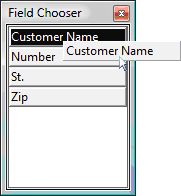
Columns can be hidden programmatically by setting the column's pbVisible property to false. The pbShowInFieldChooser controls whether or not a dragged or hidden column appears in the field chooser.
phoFieldChooserPanel contains a handle to the Field Chooser panel object. You can augment CreateFieldChooserPanel to provide a custom Field Chooser control.
See also Using Hidden Columns.
Fast Performance for Large Data Sets
The grid's Virtual Mode data display and data paging support in the datasource means that the control can support millions of rows without sacrificing performance.
Save and Restore Grid Layout
Each grid's column layout and appearance can be saved and loaded. To enable this feature:
- The grid's pbRestoreLayout property must be set to true.
- pbPreserveEnvironment in the project's cApplication object must be set to true.
- The grid's psLayoutSection property must be assigned a unique string id.
While you are designing the layout and appearance of your grids, it is advised to set pbRestoreLayout to false so that the restored layout does not override the default layout changes that you are testing.
Multi-Row Selection
Grids allow selecting multiple rows at any one time. Methods for selecting rows with the keyboard and mouse are supported, such as Shift + Arrow keys or holding the Control key while clicking on the row.
Set pbSelectionEnable to true to enable grid row selection. Set pbMultipleSelection to true to enable selection of more than one row. Call GetIndexesForSelectedRows to retrieve an array of currently selected row numbers.
You can control the grid's selection 'mode' (i.e., how rows will be selected via keyboard and mouse) by setting the grid's pbMultiSelectionMode property.
Note: With data aware grids, multi-row selection is only supported when the data source is not caching its data. You can control this via the cDbCJGrid's pbStaticData property.
Column Features
Appearance
Grid columns support many properties to control the column's appearance and colors. When a grid column object is selected in the Studio, these properties can be found in the Properties Panel under the Appearance grouping.
Whenever a grid property and a grid column property control the same feature (such as TextColor), then the setting for the grid column will take precedence within that column.
Column Headers and Footers
The grid can display or hide a column header and a column footer section. Both column headers and footers can display text, and column headers can also display icons. Different header styles, alignment, and visual behavior are supported.
To show or hide column headers and footers, set pbShowHeader and pbShowFooter respectively.
To display header or footer captions, use the column object's psCaption and psFooterText properties.
To display a header icon, set the column object's psImage property.
Resize, Remove, and Reorder Columns
The grid allows you to easily resize, remove, and reorder the columns while the application is running. Columns can be removed simply by dragging the column header off the grid, they can be resized by dragging the column border, and they can be reordered by dragging the column header to the desired position. Each of these features can be enabled or disabled for the entire grid or for individual columns.
Set pbAllowColumnResize to true to specify that columns can be resized at runtime. Set pbResizable to false in a column object to disallow resizing for that column. The column's piMinimumWidth property can also be used to control the minimum width of the column while still allowing it to be resized.
Set pbAllowColumnRemove to true to specify that columns can be removed from the grid at runtime. Set pbAllowRemove to false in a column object to disable column removal for that column.
Set pbAllowColumnReorder to true to specify that columns can be reordered by dragging while the application is running. Set pbAllowDrag to false in a column object to disable repositioning that column.
Column Sorting
The grid allows you to sort the rows according to the values of a column. Columns that are sorted can appear shaded, and the column header will have a triangle icon indicating whether the column is sorted in ascending or descending order.
See Sorting cCJGrid Data for more information.
Column Masks
DataFlex mask technology is supported within the grid. Each column's data can be formatted by applying a mask string to the raw data.
To apply a mask, set a column object's peDataType property to the appropriate data type and the psMask property using the available mask tokens.
Grid Cell Types and Features
Cell Control Types
Different data controls can be assigned to a column to control the appearance and editing behavior of the cell data. By default, a DataFlex edit control is used when editing the data of a cell.
To display and edit data with a checkbox control, set the column object's pbCheckbox property to true. The psCheckboxTrue and psCheckboxFalse properties specify the grid datasource values for a column that correspond to a checked or unchecked cell.
To specify a combo list control for cell editing, set the column object's pbComboButton property to true. See Combo Lists for more information.
Cell Appearance
The cell data's appearance and format can be controlled for individual cells. You can manipulate each cell's colors, text, image, font, and other characteristics.
To apply formatting rules or manipulate a cell's image, you would write an event handler for the OnSetDisplayMetrics event in each column where individual cells are to be manipulated.
Refer to Customizing the Display for Each Cell for more information.