Add Method
Description
Adds a new command bar control to the collection.
Syntax
Public Function Add( _
    ByVal [Type](#) As [XTPControlType](XtremeCommandBars~Enumerations~XTPControlType_EN.md), _
    ByVal [Id](#) As Long, _
    ByVal [Caption](#) As String, _
    Optional ByVal [Before](#) As Variant, _
    Optional ByVal [Temporary](#) As Variant _
) As [CommandBarControl](XtremeCommandBars~CommandBarControl.md)
Parameters
- Type
Specifies the type of control to be added. Possible values include:
- xtpControlError
- xtpControlButton
- xtpControlPopup
- xtpControlButtonPopup: This will add a control that displays an image with no caption. When clicked, a popup menu will display any added controls. The caption can be shown by setting the control Style property using an XTPButtonStyle flag.
- xtpControlSplitButtonPopup
- xtpControlComboBox
- xtpControlEdit
- xtpControlCustom: This allows you to add any control you want to your command bar. For example, you can add a progress bar or slider control to your command bar.
- xtpControlLabel: This will add a control that is used for informational purposes only. This command will not respond to the mouse and cannot receive focus. The background will be displayed in a different color. You can use this to display helpful information about your popup menu.
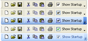
- xtpControlCheckBox: The checked property is used to determine whether the checkbox is checked or unchecked.
- xtpControlGallery
- xtpControlRadioButton
| Value | Description |
|---|---|
| Used with the Find method. Used to specify "any" control type. | |
| Specifies the button control style. | This is a normal command bar button that is used in the menu bar and toolbars. |
| Specifies the popup control style. This will add a control that displays a caption with no image. When clicked, a popup menu will display any added controls. | |
| Specifies the split button popup control style. | |
| Specifies the combobox control style. This will add a combobox control to your command bar. | |
| Specifies the edit control style. This will add an edit box control to your command bar. | |
| Specifies the custom control style. | |
| Specifies the Label control style. This will add a control that is used for informational purposes only. This command will not respond to the mouse and cannot receive focus. The background will be displayed in a different color. You can use this to display helpful information about your popup menu. | |
| Specifies the CheckBox control style. When using this style, the control's checked property is used to determine whether the checkbox is checked or unchecked. | |
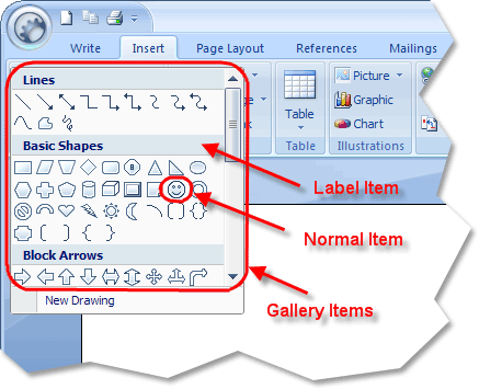
| Specifies the Gallery control style. Galleries can be placed in normal toolbars, popup menus, and ribbon groups. | |
| Specifies the Radio/Option button control style. This will add a Radio/Option button control to your command bar. |
- Id: Identifier of the control to be added.
- Caption: The caption of the control to be added.
- Before: The index of an existing control that the new control should be added before.
- Temporary: A boolean value indicating whether the control is temporary. Temporary controls will not be saved to the system registry when the application is closed (if SaveCommandBars is used), and they will not be restored when the application is opened (if LoadCommandBars is used).
Return Type
The newly added CommandBarControl object.
See Also
Copyright (c) 1998-2024 Codejock Technologies. All rights reserved.